Visual Identity
Timeline
May – July 2024
Tools
Adobe Illustrator, Adobe After Effects
Client
Division of Students
Context
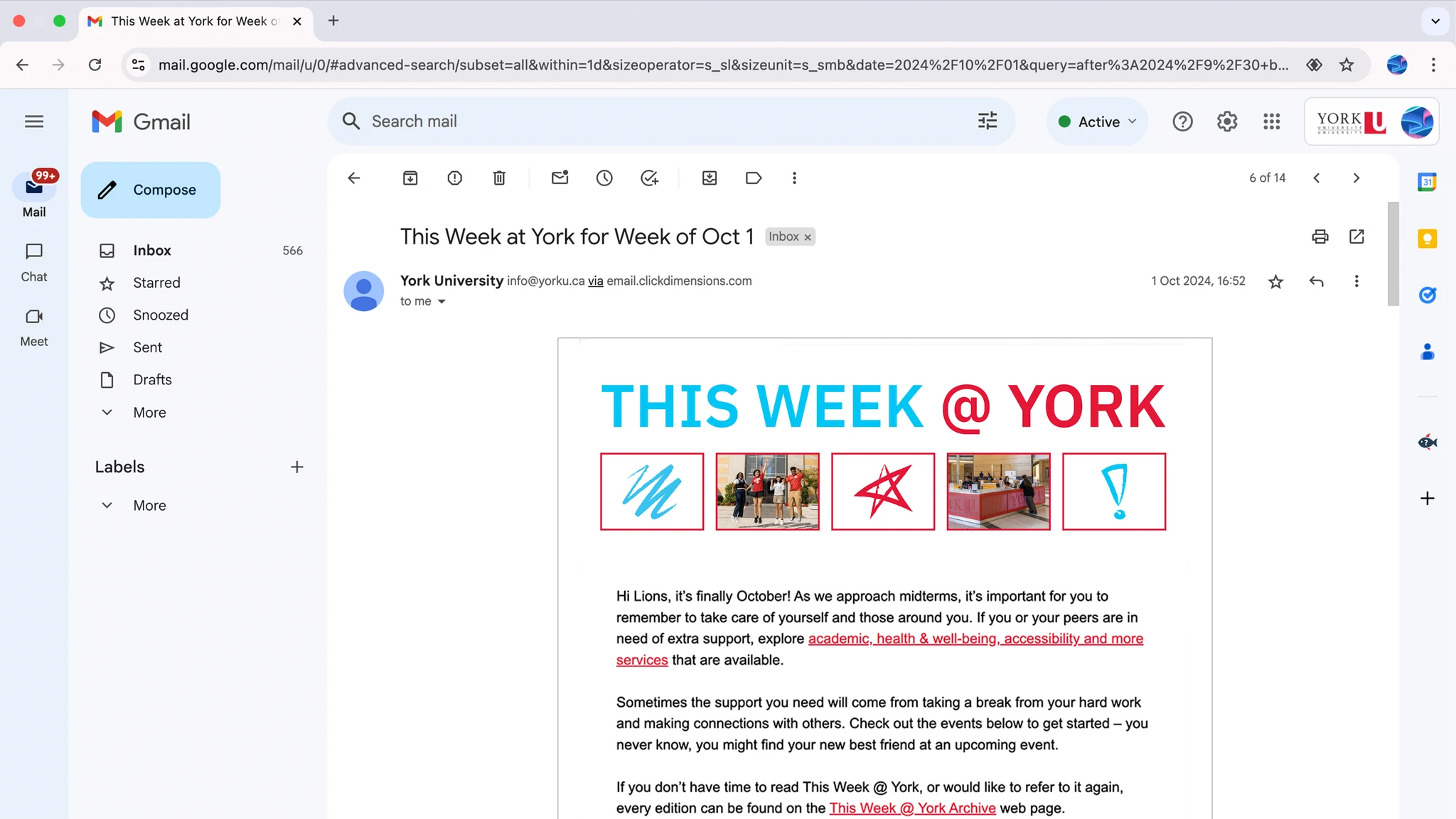
This Week @ York (TW@Y) is a weekly newsletter targeting all current students, delivering information about key dates and events occurring in the York community.
Information is presented as a list of weekly highlights, containing a wide variety of subject matter.

The Problem
Previously, students could only access TW@Y through its weekly emails or website updates. However, panel discussions with students revealed that readership would improve if TW@Y expanded to other platforms, especially among upper-year students.
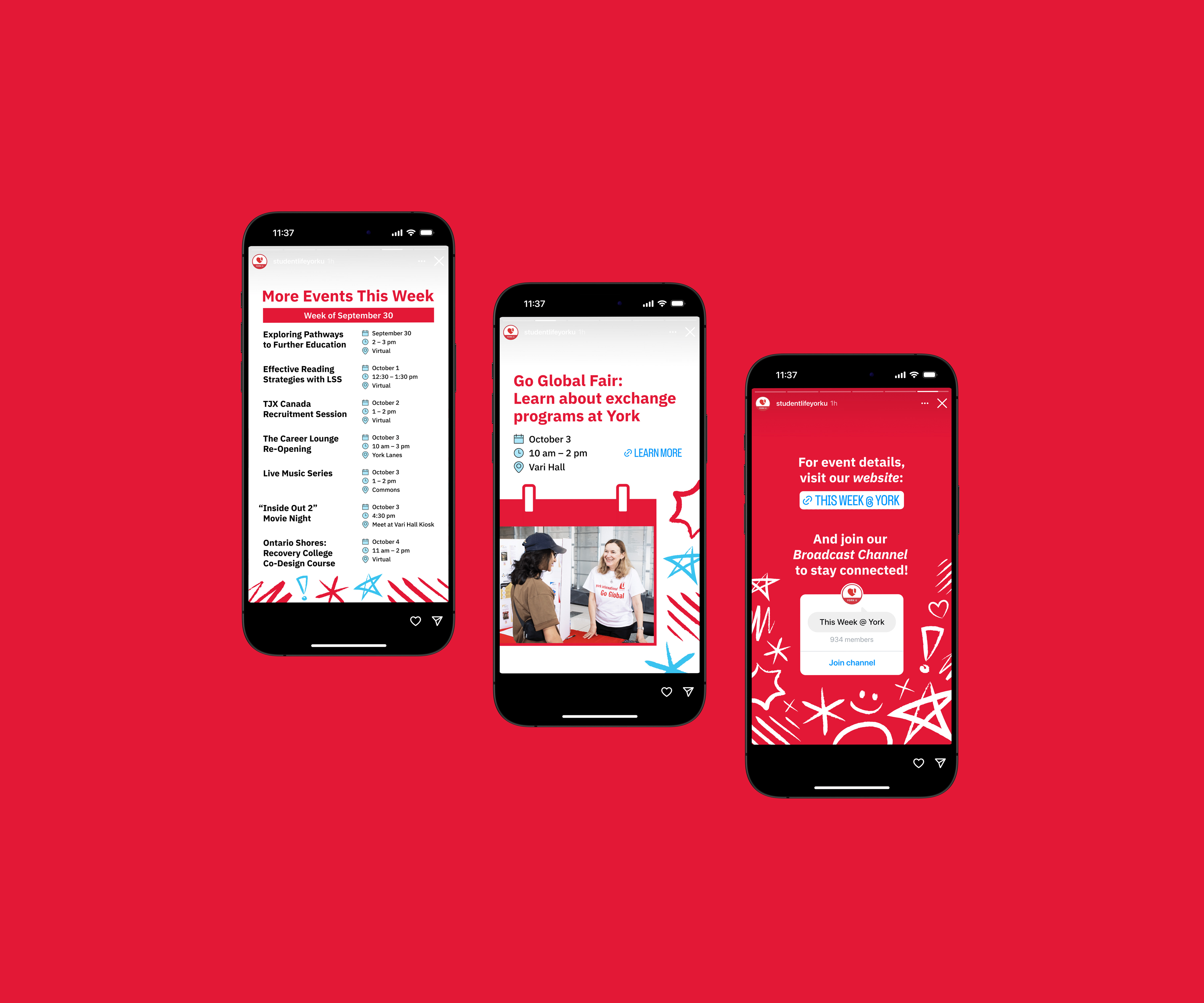
Therefore, the Division of Students sought to grow TW@Y's reach by posting its content to social media as well.
Challenge
With increased communications from This Week @ York as it fully expands to social media for the first time, how might we enhance students' recognition of all its digital materials?
Solution
A student-oriented visual identity for TW@Y, which playfully expresses the familiar act of marking off notable dates on a calendar.

Using the idea of how one might mark off key dates on a calendar, I designed a set of playful, hand-drawn markings that may be paired with calendar boxes. This visual identity expands off the York brand.
Visual Identity System
Illustrative Building Blocks
The system is based on a library of calendar boxes and hand-drawn markings. Calendar boxes represent the current news shared by TW@Y. Hand-drawn markings represent the indication of important dates on a calendar.

Colours
From the York brand, I selected the colours most appropriate for informal communications targeting internal audiences. By adhering to brand guidelines, TW@Y promotes consistent use of the brand and situates itself within the York community.
York Red
#e31837
227, 24, 55
White
#ffffff
255, 255, 255
York Bright Blue
#3ac2ef
58, 194, 239
Visual Identity Applications